
A wireframe of empty grey boxes tells a client very little. The same wireframe with a magnifying glass sitting in the search slot tells them almost everything. Icons are the shorthand of interface design: small drawings that carry meaning faster than a label, and the one part of a rough layout reviewers judge instantly.
You do not need to be able to draw to sketch them. Interface icons are assembled from a handful of shapes arranged in different ways. Learn those arrangements and you build a visual vocabulary — a set of marks you can put down in seconds without stopping to think, which leaves your attention where it belongs: on layout, hierarchy and flow.
Grabbing icons from a library is fine when you are producing finished work. During early exploration it gets in the way. Hunting for the right file interrupts the thinking, and dropping in a polished icon makes a rough idea look more resolved than it really is, which changes the feedback you receive.
Drawing them yourself teaches you something else: which details actually carry the meaning and which are decoration. After a few weeks of practice, a bin or a bell takes four seconds instead of four minutes. There is also a memory benefit: the act of constructing an icon from primitive shapes fixes its form in your mind, so you can recall and redraw it on a whiteboard during a meeting without hesitation.
Almost every interface icon is built from seven marks. Fill a page with them before you attempt a single icon, so your hand knows the shapes.
Work inside a consistent frame. Draw a light 24 × 24 box for every icon and keep the artwork about two units inside the edge. That padding is what stops a set looking cramped and helps icons sit evenly on a toolbar. For example, a search icon might use a circle of radius 6 centred slightly above the middle, with a 45-degree line extending from its lower right edge to the frame boundary. A settings icon could be three horizontal lines of equal length, each with a small circle positioned at a different point along the line to suggest a slider.
This set will cover most wireframes you sketch in your first year.
Menu: three horizontal lines of equal length. Chevron: two strokes meeting at a right angle, effectively an arrow with the shaft removed. Arrow: a line plus a chevron head; direction is the only information it needs. Home: a triangle roof over a square. Search: a circle with a line leaving the lower right at roughly 45 degrees. Close: a diagonal cross.
Add: a plus sign, kept short and even. Edit: the diagonal pencil — two parallel lines for the barrel and a small triangle for the point. Delete: a bin with a lid and two vertical strokes inside. Download: an arrow pointing at a horizontal line or tray. Settings: a cog if you enjoy drawing teeth, or three slider lines if you do not. Sliders are quicker and just as readable.
Notification: a bell — a rounded dome, a flat base, a small dot. Favourite: a five-pointed star, or a heart made from two arcs and a V. Success: a tick. Warning: an exclamation mark inside a triangle. Information: a lowercase i inside a circle.
Pick one metaphor per concept and stick to it. A bin and a cross both mean delete; using them interchangeably in the same wireframe creates doubt where there should be none. Consistency also reduces the cognitive load for your reviewer, who can scan the layout and understand the controls without reading a single label.
When you meet an icon you have not drawn before, run through the same sequence.
If the icon still feels wrong after two attempts, write the label instead. A word is better than a confusing symbol, and you can return to the drawing later with fresh eyes.
Consistency matters more than draughtsmanship. An uneven set of well-drawn icons looks worse than a neat set of crude ones.
Improvement comes from repetition, not from waiting for a client brief. Set aside ten minutes a day and work through a list of the fifty most common interface icons. Sketch each one ten times in a row, varying the size and stroke. The first few will be clumsy; by the tenth, your hand will have learned the path.
Another useful drill is the one-minute icon. Pick a concept at random — share, filter, lock, upload — and draw it as fast as you can. Speed forces you to rely on your shape kit rather than fussing over details. Afterwards, compare your sketch to a reference. You are not aiming for a perfect replica, just for the essential silhouette.
Even experienced sketchers slip into a few habits. Watch for these.
Fix these by stepping back and squinting. The icon should read as a single, confident mark, not a collection of nervous lines.
Sketching is a thinking tool, not a deliverable. Once the layout is approved and you move into visual design, switch to a consistent icon set — either drawn digitally with a grid or sourced from a well-made library. Your hand-sketched vocabulary will still guide you: you will know which details to keep and which to discard, because you have already tested them on paper.
Until then, keep your pencil loose and your shapes simple. The goal is not beautiful icons. The goal is a wireframe that communicates instantly, so the conversation can move on to the harder problems of interaction and flow.
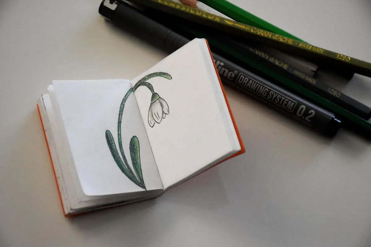
Photo: Ivan S / Pexels
Ten sketchbook habits from UK design studios that sharpen wireframing — from thumbnail sprints to failure logs —...

Low-fidelity prototypes are fast and invite honest feedback; high-fidelity ones test detail and win sign-off. Here's...

A practical, hour-by-hour guide to turning paper sketches into a clickable mobile prototype in a single focused day...

Sketching and wireframing for digital designers..