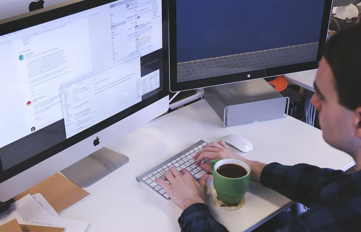
Ten screens. Half an hour. A pen, a stack of paper, and a willingness to make a mess. That is the whole toolkit for your first serious wireframing session. Software can come later. Right now, the goal is to think with your hands, to get the structure of an interface out of your head and onto something you can point at, argue with, and improve.
This guide walks you through ten low-fidelity sketches, one after another, with notes on layout, hierarchy and annotation. No drawing skills required. Just a bit of discipline and a timer.
You need a pen that doesn't smudge, a stack of A4 or A5 paper, and a timer. A fine liner is good for details; a thicker marker helps you emphasise primary elements. Loose sheets are better than a notebook because you can shuffle them around later. A grey marker or a light pencil is useful for shading secondary areas, but it's optional. Don't let missing tools become an excuse to delay.
You don't need a ruler, a stencil, or neat handwriting. You don't need an eraser either. If you make a mistake, cross it out and draw again. The page is a thinking tool, not a portfolio piece.
Before you sketch a single screen, draw ten empty rectangles the rough size of a phone screen. Inside each, draw a horizontal line near the top for a header, one near the bottom for navigation or a primary action, and divide the middle into two or three blocks. That's it. You now have a consistent frame for every sketch that follows. If you're sketching for a desktop app, draw wider rectangles. The principle is the same: consistent frames first, content second.
This warm-up feels trivial. It isn't. It stops you from drawing the same screen at five different sizes and it forces you to think about the basic anatomy of a mobile layout before you get distracted by details.
Start with the home screen or dashboard. This is your anchor because it defines the primary navigation and the main content areas. Sketch it quickly:
Use your thicker pen for the most important element on the screen. If everything is bold, nothing is. Ask yourself: what is the one thing a user must see first? Make that the largest, darkest shape on the page.
Divide the screen into thirds vertically. The top third is for context (where am I?), the middle for content (what can I do here?), and the bottom for action (what happens next?). Most mobile screens follow this rhythm. When yours doesn't, have a reason.
Pick a simple task: booking a table, buying a book, finding a recipe. Then sketch the steps.
For a recipe app, screen two might be a search field with dietary filters, screen three a list of recipe cards, screen four a single recipe with ingredients and steps, and screen five a confirmation that the recipe was saved. Keep the same header and footer across all four so the flow feels coherent.
For each screen, ask: what is the one thing the user must do here? Make that element the most prominent. Everything else is secondary. If you can't tell what the primary action is, the sketch is telling you something useful: the real design has a problem.
Use three levels of visual weight. Primary elements get thick lines and large boxes. Secondary elements get thin lines and medium boxes. Tertiary elements get dotted lines or small squiggles. This isn't decoration. It's how you guide the eye without colour or type.
Now push. Sketch alternative layouts for the same screen. For example, a list view versus a grid view for your results. Then sketch error states: wrong password, no results, failed payment. These are the screens that reveal whether your flow is robust. They are also the ones beginners skip because they feel negative.
For the recipe app, an error state might show "No recipes match your filters" with a clear way to reset them. A variation might show the results as a grid instead of a list. Both are quick to draw and both force decisions.
Don't skip them. A wireframe that only shows the happy path is half a wireframe. When you draw an error state, you're forced to decide what went wrong, what the user needs to know, and how they recover.
Empty state: what does the screen look like with no data? Loading state: what appears while the app is waiting? Success state: what confirms that an action worked? These sketches force you to consider the whole journey. They also give developers and stakeholders a complete picture, which reduces the number of "what about..." conversations later.
Annotations are notes that explain behaviour, content or logic. Write them outside the screen frame, connected by a line or a number. Use a key at the bottom of the page.
Keep annotations short. A few words. If you need more, use the back of the sheet. The sketch should still be readable at a glance. Use arrows to show transitions. A simple arrow from a button on screen three to the top of screen four is enough.
Here's how to fit ten sketches into half an hour without rushing into nonsense. Work standing up if you can. It keeps you loose and stops you from fiddling.
When the timer stops, stop. Put the pen down. Spread the sheets on a table and look at them as a set. You'll see gaps, repeated patterns and at least one idea worth keeping. That's the point. The sketches are not precious. They are a conversation starter. If you want to keep going, pick the best three and redraw them larger. If not, you've still done more structural thinking in thirty minutes than most people do in a week of clicking around a design tool.
Photo: chachbrand / Pixabay
Ten sketchbook habits from UK design studios that sharpen wireframing — from thumbnail sprints to failure logs —...

Low-fidelity prototypes are fast and invite honest feedback; high-fidelity ones test detail and win sign-off. Here's...
A practical, hour-by-hour guide to turning paper sketches into a clickable mobile prototype in a single focused day...

Sketching and wireframing for digital designers..